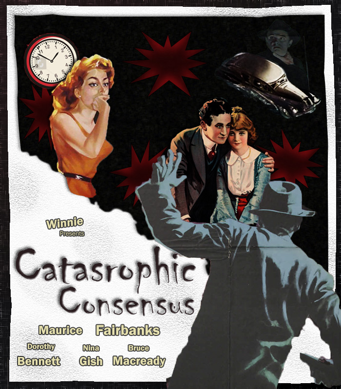
The background is an inspiration for an old movie poster I started off with a diamond gradient background and changed the colors
and added more points to the gradient. Then I added a filter to add fiber to the background. I then used the rectangle tool on top
and used the paper filter. Then I used the puppet tool to make the paper look folded and ripped. I also used the burn tool to add
texture to the paper. Then I used another rectangle tool and masked out half to make it look ripped and added another filter and
did the same thing with the puppet tool. Then I used the shape tool to create stars around the background to add detail. Then I added
the satin FX to give it more depth. For the words on the poster for fx I added drop shadow, stroke, and bevel and emboss. For winnie
I used the distort tool to make it slant.
For this image I took out the bottom guy and edited the photo and change the hue and saturation so the guy has less color in him.
I also used the masking tool to grab him out of the photo as a whole. Then used the distort tool to make him look ghostly behind
the car. Finally I changed his opacity so that he looks like a ghost in the background. I also used the magic selection tool to
grab the car then I used the perspective tool to make it look wonky. Then I used a black and white adjustment layer and set it as
an overlay then made it a clipping mask to make the car look darker.
The first thing I did for this photo was edit the levels to make them look darker then the wrest of the photo. I then enhanced the
contrast so the reds would stand out more then the original. Then I used the mask tool to get the man and women out of the original
photo and used the drop shadow effect to make it look less flat.

For this photo I really liked the look of the photo so I used the magic tool to grab him out of the photo. I then scaled him to be bigger
so that is looks like he is looming over the people.
I first masked the women out of the photo and cut off half of her so that she would fit in. Then I masked her out again on my poster to make it look cohesive as if the page had been ripped. Then added a drop shadow so she would look less flat.

For this photo I clipped out the clock and scaled it up on the movie poster. Then I moved the layers around so that the women was over the clock.